 By admin
Floating elements have been a cornerstone of web design, providing creative solutions for layout challenges. As design practices evolve, understanding their functionality remains critical for creating engaging user experiences.
What You Will Learn
- Floating elements allow for flexible layouts by enabling content to wrap around them, enhancing visual appeal.
- Clear floats using the `clear` property to maintain layout integrity and avoid overflow issues.
- Employ floating elements for practical uses, such as image/text wrapping and horizontal navigation menus.
- Integrate modern CSS techniques like Flexbox and Grid for greater layout control than traditional floats.
- Utilize media queries to ensure floating elements are responsive across different devices and screen sizes.
- Floating Action Buttons (FAB) can enhance user engagement by providing easy access to primary actions.
- Explore real-world examples and case studies to observe effective use of floating elements in modern design.
- Leverage front-end frameworks like Bootstrap to streamline the integration of floating elements.
Key Aspects and Trends in Floating Elements
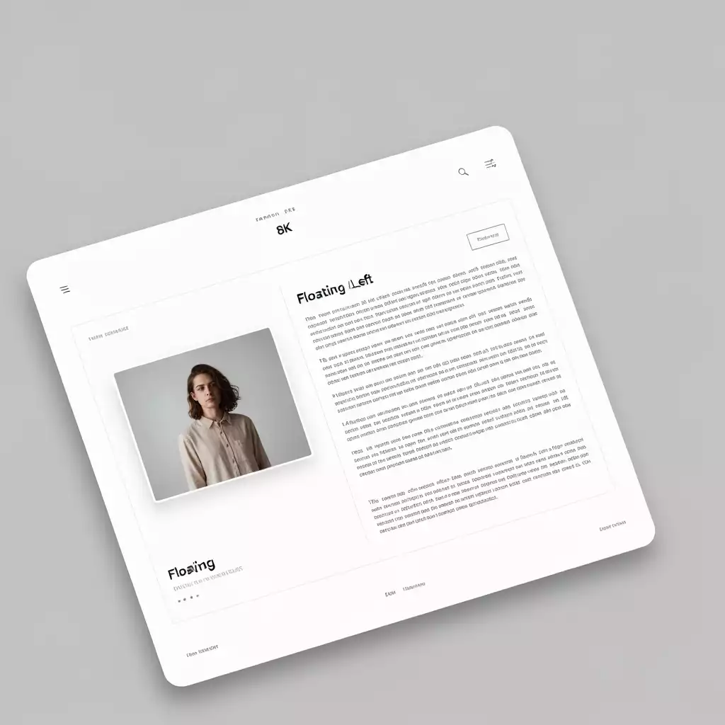
The visual below illustrates the core concepts and modern applications of floating elements in web design, highlighting their evolution and current best practices.
Defining Floating Elements
Core Concepts
- Left Float: Element to left
- Right Float: Element to right
- Clearing Floats: Maintain layout integrity
Applications & UI Design
Use Cases
- Image & Text Wrapping: Engaging layouts
- Navigation Menus: Horizontal links
- Card Layouts: Grid-like arrangement
Implementation & Trends
Technical Side
- CSS Float: Effective but challenging
- Flexbox & Grid: Modern alternatives
- Responsiveness: Media queries adaptation
Enhancements & Future
User Experience
- FABs: Quick access to primary actions
- Visual Hierarchy: Intuitive navigation
- Engagement: Draw attention to key content
Understanding Floating Elements in Web Design
When we talk about web design, one of the key concepts that comes into play is floating elements. These are crucial for creating visually appealing and functional layouts. Understanding how they work can help you create websites that are not only attractive but also user-friendly. So, let’s dive into what floating elements are and why they matter!
Floating elements allow us to position elements to the left or right of their container, enabling the surrounding content to wrap around them. This technique has been a staple in web design for years, and it’s still relevant today, especially when combined with modern CSS practices. Learn more about maintaining layout integrity in other contexts.
Defining Floating Elements: What They Are and How They Work
At their core, float properties in CSS are all about positioning. When an element is floated, it is taken out of the normal document flow, allowing other elements to surround it. This is useful for creating layouts where you want an image alongside text, for instance.
- Left Float: The element is floated to the left side of its container.
- Right Float: The element is floated to the right side of its container.
- Clearing Floats: It’s essential to clear floats to maintain layout integrity. This can be done with the `clear` property.
These properties offer flexibility in design, but they come with their own challenges. Understanding how to manage floats effectively is crucial for a successful layout!
Use Cases of Floating Elements in Modern Websites
Floating elements aren’t just for nostalgia; they have real-world applications in today’s web design landscape. Here are some common use cases:
- Image and Text Wrapping: Use floats to position images alongside paragraphs for a more engaging layout.
- Navigation Menus: Float links horizontally to create seamless menus.
- Card Layouts: Align multiple cards side by side in a grid-like fashion.
These use cases highlight the versatility of floating elements. However, as we progress into more advanced layout techniques, it’s essential to know when to utilize floats and when to consider alternatives, such as those discussed in modern technology trends.
How Floating Elements Fit into User Interface (UI) Design
In user interface design, floating elements play a crucial role in enhancing the user experience. By strategically placing elements, we can guide users through our content in a more intuitive manner. For example, floating a sidebar can provide additional navigation options without cluttering the main content area.
- Visual Hierarchy: Floating elements help establish a clear visual hierarchy, making it easier for users to navigate.
- Engagement: Well-placed floats can draw attention to key content, improving user engagement.
- Responsive Design: Using floats creatively can aid in creating responsive layouts that adapt to various screen sizes.
By leveraging floating elements effectively, we can create interfaces that are not only visually appealing but also functional. This creates a seamless experience that keeps users coming back for more!
The Technical Side: Implementing Floating Elements
Now that we’ve covered the basics, let’s talk about how to implement floating elements in your designs. Understanding the technical side is crucial for anyone serious about web design. We’ll explore how to use CSS float effectively and discuss modern alternatives.
Pro Tip
To truly master the use of floating elements, consider combining them with modern CSS techniques like Flexbox and Grid. This hybrid approach allows you to leverage the strengths of floats for specific layout needs while ensuring greater responsiveness and control over your designs. Don’t hesitate to experiment with these combinations in your projects!
Summarizing the Role of Floating Elements in Web Design
As we wrap up our discussion on floating elements, it’s crucial to recognize their significant impact on web design. Floating elements have been a staple in web development, serving various purposes from layout structuring to enhancing user experience. However, with evolving technologies, we must balance their use with modern practices.
Here are some key takeaways to keep in mind:
- Floating elements can effectively create multi-column layouts, but they may lead to issues if not managed properly.
- Integrating CSS Flexbox and Grid Layouts can often provide more control and flexibility than traditional floats.
- Responsiveness is essential; utilize media queries to ensure floating elements adapt to different screen sizes.
These points highlight the necessity of understanding the role of floating elements while being open to newer, more efficient methods that can enhance both design and performance!
Future Trends: The Evolution of Layout Techniques in Web Design
Looking ahead, the landscape of web design continues to evolve, and the techniques we use will adapt accordingly. While floating elements have their place, newer technologies are emerging that offer even more robust solutions. CSS Grid and Flexbox are leading the charge, making layout design more intuitive and less error-prone.
- Increased use of CSS Grid for complex layouts that require precise control.
- Flexbox becoming the go-to for single-dimensional layouts that need to be responsive.
- Enhanced focus on accessibility and user experience as more sites prioritize these aspects.
As a web designer, I’m excited about these trends! By staying updated and adapting to new methods, we can create stunning, functional designs that cater to user needs and preferences. This drive to improve and adapt parallels the themes of personal growth, such as those explored in personal development journeys.

How Floating Action Buttons (FAB) Enhance User Experience
One innovative use of floating elements is through Floating Action Buttons (FAB). These buttons provide a quick access point for primary actions within an app or website. By floating above other content, they are always visible, allowing users to easily engage without searching through navigation options.
- FABs boost user engagement by simplifying navigation to essential features.
- They enhance usability on mobile devices where screen real estate is limited.
- Effective use of color and animations can draw attention to FABs, increasing interaction rates.
Incorporating FABs into your designs can significantly enhance the overall user experience. I’ve seen firsthand how small design choices, like the placement and style of a FAB, can lead to improved usability on websites!
Engage and Apply: Moving Forward with Floating Elements
Practical Steps for Implementing What You’ve Learned
Now that we’ve covered the nuances of floating elements, it’s time to put this knowledge into practice! Here are some practical steps to follow:
- Start by experimenting with basic float properties in your projects.
- Gradually incorporate Flexbox and Grid Layouts to see how they compare.
- Utilize media queries to enhance the responsiveness of your floating elements.
By taking these steps, you’ll develop a deeper understanding of how to integrate floating elements effectively while embracing new technologies!
Explore Real-World Examples and Case Studies
To further solidify your knowledge, consider exploring real-world examples and case studies. Look at how top websites utilize floating elements, as well as how they transition to more modern layouts. Some excellent sources include:
- Web design blogs that showcase innovative design projects.
- Online portfolios of designers focusing on user experience.
- Open-source projects on GitHub that highlight modern layout techniques.
These resources will provide you with practical insights and inspiration, helping you understand how to apply floating elements in your own designs.
Utilizing Front-end Frameworks for Enhanced Floating Elements
Finally, consider leveraging front-end frameworks like Bootstrap or Foundation. These frameworks offer built-in support for floating elements and responsive design. By utilizing these tools, you can streamline your development process while ensuring consistency across various devices.
- Boost your productivity with pre-defined classes for floating elements.
- Ensure compatibility and responsiveness without extensive custom coding.
- Take advantage of community support and documentation for troubleshooting.
Incorporating front-end frameworks into your workflow will not only make your designs more efficient but also elevate your overall web development skills! For more on efficient development, check out resources like increasing productivity and finance.
Recap of Key Points
Here is a quick recap of the important points discussed in the article:
- Floating elements play a significant role in creating visually appealing layouts by allowing content to wrap around them.
- Proper management of float properties is essential to maintain layout integrity, including using the `clear` property when necessary.
- Modern layout techniques like CSS Flexbox and Grid provide more control and should be considered as alternatives to traditional floats.
- Responsive design is crucial; utilize media queries to ensure floating elements adapt well across different devices.
- Incorporating Floating Action Buttons (FAB) can enhance user experience by providing quick access to primary actions on a website.
Frequently Asked Questions about Floating Elements in Web Design
- What are floating elements in web design?
- Floating elements are HTML elements styled with the CSS `float` property, which allows them to be positioned to the left or right of their container. This enables surrounding content to wrap around them, facilitating flexible and visually appealing layouts.
- Why are floating elements important for layout design?
- Floating elements are important because they enable content like images to sit alongside text, create multi-column layouts, and help in positioning navigation menus or card-based designs. They are foundational for many classic web layouts.
- What is “clearing floats” and why is it necessary?
- Clearing floats refers to using the `clear` CSS property to prevent an element from positioning itself next to a floated element. It’s necessary to maintain layout integrity, prevent content from flowing incorrectly, and avoid issues like parent containers collapsing if they only contain floated children.
- How do modern CSS techniques like Flexbox and Grid compare to floats?
- Flexbox and CSS Grid are more modern and robust layout modules designed specifically for complex layout challenges. Flexbox is ideal for one-dimensional layouts (rows or columns), while Grid is for two-dimensional layouts (rows and columns simultaneously). They offer more control, flexibility, and are generally easier to manage for responsive designs compared to floats, which were originally intended for text wrapping around images.
- How can Floating Action Buttons (FABs) improve user experience?
- FABs enhance user experience by providing readily accessible primary actions, usually a circular button that floats above other UI elements. They make it easier for users to perform key tasks quickly, especially on mobile devices where screen space is limited, thus improving engagement and navigation.