———————————————————————————————–
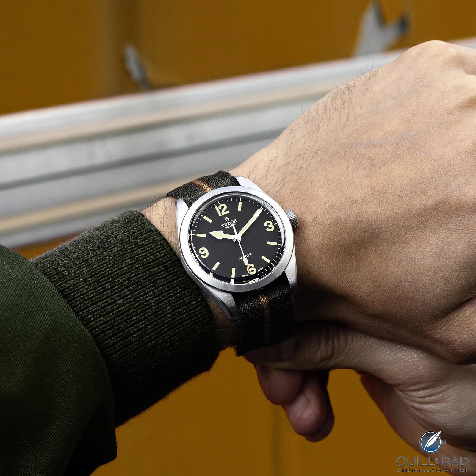
The next issue is the size. It is still too large, and the design details make it look even larger than it is. On paper 39 mm is a good size, but here it is still too much. The smooth bezel, the flatness of the dial, lack of text and 12-3-6-9 lead to vast areas of empty space.
Firstly, they could have added more text. This is a COSC-certified, automatic movement and Tudor has never had a problem advertising this on the dial previously. This might be the only time they went too far the other way.
On my Black Bay 36, it has the curved ‘self-winding’ on the dial similar to the previous Ranger, and even this would have helped. If they were to not add any extra text, at a minimum the “Ranger” text should be larger.
For what is meant to be a field watch, on the wrist, the Ranger feels slightly unnatural.
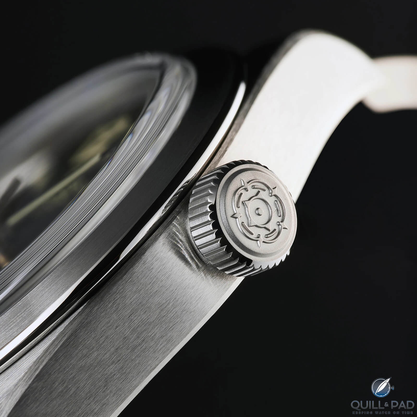
Tudor Ranger crown and caseband
Finally, I love brushed finishes and find them much more versatile and wearable, but in this case, they might have gone too far. It looks good, but when you see the watch in person, the matte adds to its flatness.
It does not make any attempt to catch the light apart from the thin polished accent around the bezel. This adds to the no-nonsense legibility and is part of why it has such a tool watch vibe (similar to what we see with the IWC Mark series). However, given the price, it feels a bit boring.
The Ranger tells you the time, but beyond that, you can get much more interesting pieces for much less. It gives me the impression that there was a lack of thought on the design side as the final product is not very complex.
To summarize everything above, Tudor has created a perfect watch on paper, but there are small areas that make it just a few steps away from being actually perfect. I am starting to think this is becoming something Tudor does more often with their releases.
This is not a knock on Tudor because I love what they do. I love that they push the boundaries and experiment with new materials and colorways, giving us excitement and something fresh every year.
Another example where they have been close but not quite perfect is the Black Bay Pro. It looks fantastic and takes design cues from one of the coolest watches Rolex made (Explorer II 1655), but after the hype died down, it is clear that the proportions were not ideal and it’s too thick.
I don’t necessarily mind this because I would rather have Tudor remain exciting and try new things than copy its big brother, Rolex. It is just worth keeping in mind when the next release comes and looks fantastic at first sight. Take a step back and look a little deeper.
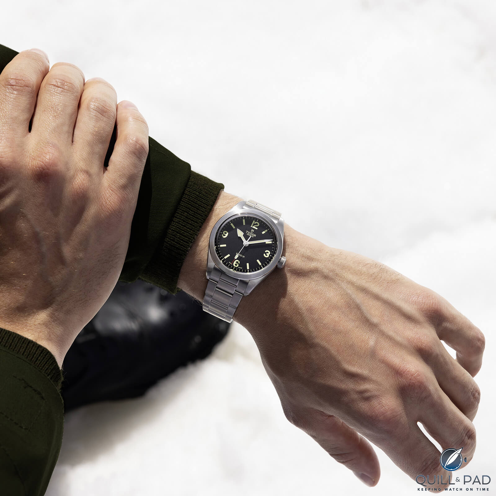
Tudor Ranger on the wrist
———————————————————————————————–
